
The Google Web Font directory has grown into an amazing resource for designers. Not only does it allow for more creativity in your web designs, you can even use the fonts to improve your page load speed and really stand out from the crowd. Read on to find out more…
Check out this blog post I'm reading: Google Web Fonts for designers: the complete guide Share on XUsing Google Web Fonts as a designer
The beauty of Google Web Fonts is that you can match the type of font to the type of website very easily. An Italian restaurant website can benefit from a beautiful scripted serif font, whilst a blog on the latest gadgets can go for a computer-esque sans serif. It’s quicker to use than @font-face, and you can change styles rapidly if you find they don’t work for you.
Tip: When you use a Google Web Font, search the web for the same download to store on your computer. That way if you’re thinking about using the font on an image, you have it right there for easy access.
Google Web Fonts and clients
Have you ever been in the situation where a client wants a title or heading changed on an image months or even years later? Google Web Fonts mean you don’t have to trawl your computer or cloud storage for old PSDs and images. Revisions at any stage are super fast when you don’t have to fuss with images, particularly when dealing with clients who change their minds a lot!
How to use Google Web Fonts
Simply head to http://www.google.com/webfonts to preview the fonts on offer. The ‘quick use’ option lets you paste the stylesheet URL into your header file, and then all you need to do is include the line relating to the font in your CSS.
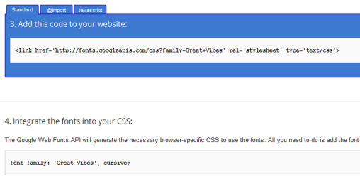 There are other options in the process if you want more control, but these two are the only necessary ones for implementation
Once you’ve checked it works, you can then style your fonts further to really make them stand out. Shadows and 3D effects tend to work particularly well, although in some instances you will need to use larger fonts to ensure they are still legible.
As you know, one of the most crucial aspects of web design is attention to detail; it’s the core difference between a premium design and a basic one. Google Web Fonts give you a quick and easy way to make your design look more focused and consistent, giving you that quality ‘attention to detail’ finish.
Tip: Keep an eye out when you browse the web to see what fonts are being used everywhere. Lobster has been a firm favourite but is rapidly becoming overused.
The SEO benefits of Google Web Fonts
Before the Google font directory, if you wanted a text title, it had to be pretty plain. Even with snazzy CSS effects, it was kind of obvious that it was a standard web font. Thanks to Google Web Fonts, you can now use a wide variety of serif and sans serif fonts for H1s, H2s and all the other headings and subheadings on websites. They still look distinctive, can be styled and changed easily, and as long as your titles are optimised they are much better than images for SEO because they have less impact on your page speed.
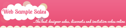 The titles above are pure text (and CSS) using fonts from the Google Web Directory
Tip: Make sure your titles target your keywords effectively and try to avoid using more than two Google Web Fonts on the same website or you risk impacting page load speed significantly.
Over to you
Do you use Google Web Fonts or are you an @font-face fan? Let us know in the comments!